A variable is a characteristic of an entity that may take on different values.
If you are studying local climate, your variables might include temperature,
precipitation, wind speed, humidity and hours of sunlight. The values of each
variable change over space and time (see the table of weather records for two
locations). You may find trends and patterns in the variations that will help
to explain local climate events.
Example: Weather conditions on July 24 at Victoria Airport
| Variables
| Values
|
| Location
| A
| B
|
| Day temperature
| 22
| 26
|
| Night temperature
| 6
| 8
|
| Wind speed
| 10 km/h
| 2 km/h
|
| Precipitation
| 2 mm
| 10 mm
|
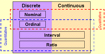
Characteristics of Data
Data and variables are classified in three ways:
| A.
| Quantitative
numeric data
| OR
| Qualitative
number, text or symbol used as codes
|
|
|
| B.
| Discrete
events or objects are integers, e.g. 1 earthquake or 2 earthquakes, not
1.5 earthquakes)
| OR
| Continuous
variable may taken on any value on a number scale, e.g. 1.6 kg)
|
|
|
| C.
| Level of measurement: indicates the amount of information
a variable contains and which mathematical operations can be performed on
the data. There are 4 levels of measurement:
|
|
|
|
| 1. NOMINAL: Numbers are used as labels, but there is
no hierarchy implied by the codes. You can count the observations in each
category, but you cannot use the codes to establish an order.
Example: features on a map are coded as follows:
1 = Lake
2 = River
3 = Road
4 = Campsite
5 = Urban area
You can count the number of lakes, roads, etc. on the map but you cannot
order, add, multiply, or divide the numerical codes.
|
|
|
|
| 2. ORDINAL: Observations can be ranked or have a rating
scale attached. You can count and order the observations.
Example: in movie theaters, you can buy a small, medium or large
popcorn. While you know a large popcorn is bigger than small or medium,
you do not know exactly how much bigger.
|
|
|
|
| 3. INTERVAL: The distance interval between units on a
scale can be determined, but the zero point is arbitrary. Values can be
added and subtracted but not meaningfully multiplied or divided.
Example: an interval of 365 days separates the start of 1998,
1999 and 2000, but the zero point (0 AD) is arbitrary as time did not
begin then. You can say that 1990 AD minus 1885 AD equals 115 years. However,
1990 AD divided by 300 AD equals 6.6, which is not meaningful (i.e. you
cannot say that 1990 AD is '6.6 times bigger' than 300 AD). Additional
examples include elevation (the zero point of 'mean sea level' is arbitrary)
and temperature in �C or �F (0� is arbitrary on these scales).
|
|
|
|
| 4. RATIO: Values have a natural zero that indicates the
absence of the property under consideration. Values can be multiplied and
divided meaningfully.
Example: in a fish tagging survey, salmon A is 20.3 cm long and
salmon B is 46.7 cm long. B is 26.4 cm or 2.3 times longer than A.
|
The diagram below summarizes the classification of variables:
|
Practice: classify the data from this forestry
survey:
|
| Tree ID
| Species
| Height (m)
| Elevation (m)
| # of scars
| Damage rating
|
|
| B-11
| Pine
| 23.5
| 347
| 1
| Low
|
| B-15
| Pine
| 15.6
| 960
| 5
| Severe
|
| C-42
| Spruce
| 22.3
| 826
| 3
| Medium
|
| F-01
| Douglas-fir
| 45.2
| 450
| 0
| Low
|
| Qual or Quant
|
|
|
|
|
|
|
| D or C
|
|
|
|
|
|
|
| Level
|
|
|
|
|
|
|
Check your answers
The statistical tests that you can apply depend on the measurement level of
the data you collect. If you collect data on people's responses to political
statements using rankings (1= strongly disagree to 5 = strongly agree), you
cannot calculate statistics involving ratios (such as the mean or standard deviation).
Precision, Accuracy and Validity
Precision: the exactness of the measurement. Often, precision depends
on the measurement instrument. With a ruler, you could measure the width of
a tree branch to within  1 mm.
With digital calipers, you could read to within
0.1 mm or even 0.01 mm. Therefore,
the calipers are more precise than the ruler.
1 mm.
With digital calipers, you could read to within
0.1 mm or even 0.01 mm. Therefore,
the calipers are more precise than the ruler.
Accuracy: how close the measured value is to the true value. If the
calipers are improperly calibrated, your measurements may be several millimetres
over or under the true value. The measurements would be precise, but not accurate
as they are not close the true value. If measurements are always over or under,
they are considered to be consistently or systematically biased.
Validity: in its simplest form, validity is the degree to which a variable
measures what it is supposed to measure. For many physical variables, validity
is not an issue - stream depth is stream depth. However, surrogate variables
are often used to measure and understand general concepts, such as quality-of-life,
human development, ecological productivity. How would you 'measure' quality-of-life?
Is tree height a valid measure of ecological productivity?
These are numerical or graphical tools for describing, exploring, summarizing,
and presenting data.
|
Questions you might ask:
| Tools for finding the answers:
|
|
What is the pattern of values?
| Distributions: frequencies, histogram,
skewness, kurtosis
|
|
What is the typical value?
| Measures of central tendency:
mean, median, mode
|
|
How spread apart are the values?
| Measures of dispersion: standard
deviation, interquartile range, range
|
Consider a dataset containing the heights of 30 adults. This collection of
heights is called a distribution of data.
| Height (cm)
|
| 158
| 165
| 168
| 168
| 170
|
| 171
| 172
| 172
| 172
| 174
|
| 174
| 174
| 176
| 176
| 177
|
| 177
| 177
| 177
| 177
| 179
|
| 179
| 179
| 181
| 181
| 183
|
| 183
| 185
| 188
| 192
| 195
|
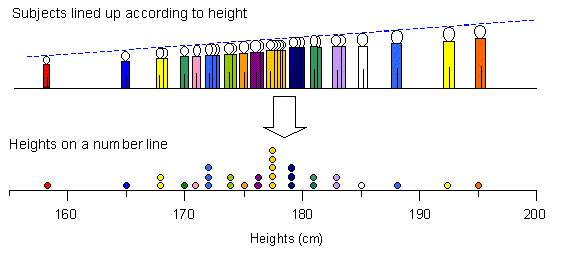
What do you expect the distribution to look like if you lined the group of
people up according to height? There are several ways to view the pattern of
your distribution. One way is to construct a dot plot, showing the values as
dots on a number line. Whenever you have 2 or more subjects with the same value,
you stack the dots. You can then begin to see the shape of the distribution:
many dots in the middle, a few at each end.
Constructing dot plots is very time-consuming when you have more than about
20 points. A more efficient method is the histogram, which is based on a frequency
table. To build a histogram you must establish classes or intervals for your
data (if you have nominal or ordinal data, your classes are already defined).
Guidelines for defining intervals for interval or ratio data:
- Use simple limits for your intervals: 10.0 to 14.9, 15.0 to 19.9, etc.,
are better limits than 3.4 to 7.8, 7.9 to 12.2, etc. Start your lowest limit
at the first round number below the first observation and your upper limit
just above the highest observation.
- Make sure your intervals are all the same width; otherwise, your summary
may be very misleading.
- Make sure your intervals include all the observations and do not overlap.
If you use the intervals 10 to 15 and 15 to 20, where you put place the value
15? Also, it's a good idea to specify your intervals to one more decimal place
than your most precise observation so that it is clear how your data fit into
the intervals.
- Select an appropriate number of groups:
- Order your data and look at the distribution of values - are there any
natural gaps or groups? Try to make your intervals capture these trends
in the distribution (refer back to the dot plot of heights).
- Find a balance between data completeness and simplicity. If you use
many groups, it will be difficult to see a pattern as each group may only
have one or two observations. If you use only a few groups, your observations
may be lumped together and you miss important trends.
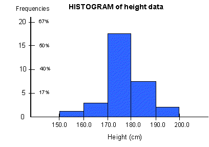
In this case, we divided the data into 5 groups, starting at 150 cm and using
intervals of 10 cm. You could divide the data into more or fewer intervals or
start at a different place (perhaps 155 cm). Once the intervals are established,
we count the number of observations in each category to find the frequency.
We can also calculate the relative frequency, which is the frequency
of each interval divided by the total number of observations. Relative frequencies
make it easier to compare distributions with different samples sizes or different
measurement units. Relative frequencies can be expressed as a decimal or a percentage.
| Frequency Table for Height Sample
|
| Interval
| Frequency
| Relative Frequency
|
| 150.0 - 159.9
| 1
| 0.03
| 3%
|
| 160.0 - 169.9
| 10
| 0.10
| 33%
|
| 170.0 - 179.9
| 17
| 0.57
| 57%
|
| 180.0 - 189.9
| 7
| 0.23
| 23%
|
| 190.0 - 199.9
| 2
| 0.07
| 7%
|
| Total
| 30
| 1.00
| 100%
|
Drawing a histogram of the frequencies provides a visual picture of
the data. The x-axis contains the categories or intervals; the y-axis is labeled
with the frequencies (relative frequencies are also shown on our graph). Notice
how the rectangles in the middle of the graph are taller than those at either
end of the graph - the size and area of each rectangle should be proportional
to the frequency of observations in each interval.
Notice how the histogram makes the distribution look 'blocky'. This is fine
for nominal, ordinal or discrete data and spaces are usually left between each
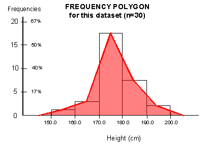
category on the graph in these cases. For continuous data (where the data may
have any value within the distribution), a frequency polygon is a better
representation of the frequencies. The area of the polygon is equal to the sum
of each rectangle area.
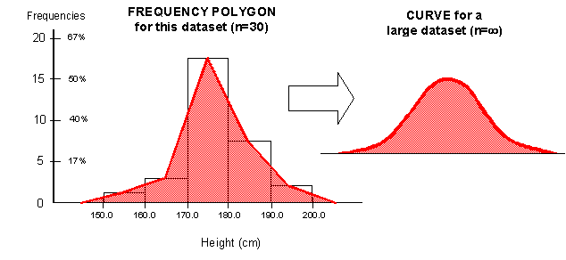
The shape of this polygon is still crude because it is based on few observations.
If we had a large dataset (with thousands of observations), the polygon will
start to smooth out into a curve. The area under this curve represents
the frequencies in your distribution. The concept of area under the curve
is very important in inferential statistics as you will see in later labs.
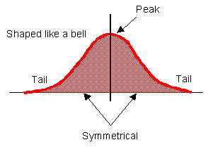
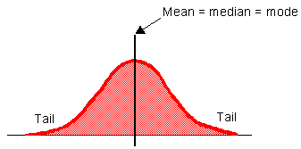
In the diagram above, the curve is bell-shaped, has one peak in the middle
and is symmetrical (the left side is a mirror-image of the right side). Distributions
with this shape are considered normal as many distributions in nature
follow this shape. For example, if you measure the size of fish caught in a
net, you would probably find a few small fish, a few big fish, while the bulk
of the fish would be somewhere between the two extremes.
Characteristics of the normal curve
|
However, there are distributions that do not follow this ideal shape. The
table below shows three ways of describing the shape of your curve. Compare
these shapes to the normal curve above.
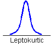
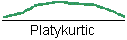
Peakedness or kurtosis (not required for Geog 226)
- Mesokurtic: distribution has central
peak but data also spread to ends (also called "bell-shaped")
- Leptokurtic: observations are very
clustered in a central peak.
- Platykurtic: distribution is flat
- peak is minor or absent
| 
|
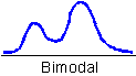
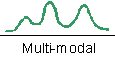
Number of peaks
- Unimodal: one main peak
- Bimodal: two peaks (may be two separate
factors influencing the distribution of data: eg. one peak in height for
males, one for females)
- Multi-modal: many peaks
| 
|
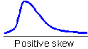
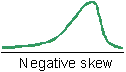
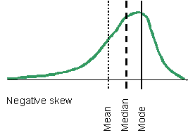
Symmetry or skewness
- Symmetrical: the two sides of the distribution
are equal
- Positive skew: the long tail of the
distribution stretches to the positive (large values) end of the x-axis
- Negative skew: the long tail of the
distribution stretches to the negative (small values) end of the x-axis
| 
|
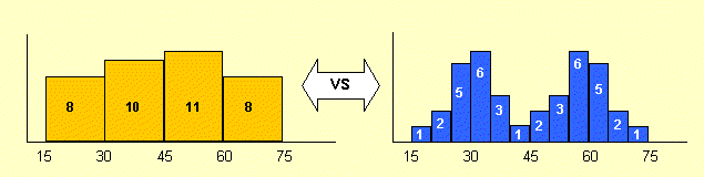
The width and number of intervals selected will influence the shape of your
histogram and your conclusions about the nature of the distribution. Your histogram
should highlight the characteristics of your data, not hide them. The diagram
below shows how different interval widths can change the shape of a histogram,
and your interpretation of the distribution. The distribution on the left would
be considered platykurtic and unimodal, the distribution on the right is mesokurtic
and bimodal.
Many statistical tests use the normal curve as a model for the 'expected' distribution.
If a distribution is highly skewed or has multiple peaks, you may not be able
to use certain tests. Always look at your data before plunging into statistical
analysis!
An important characteristic of a distribution is the location of the typical
value or 'center' of the data distribution. There are several numerical measures
of central tendency, each with certain advantages and disadvantages.
1. Arithmetic Mean
The arithmetic mean,  ,
represents the 'average' observation in a data set. It is also the center of
gravity or balancing point in the data set. The mean is the sum of all observations
divided by the number of observations. The mean can be calculated for interval
or ratio data only.
,
represents the 'average' observation in a data set. It is also the center of
gravity or balancing point in the data set. The mean is the sum of all observations
divided by the number of observations. The mean can be calculated for interval
or ratio data only.
Example: given stream velocities (m/sec): 2, 6, 17, 49, 88, 56, 33,
25, 4
= (2 + 6 +17 + 49 + 88
+ 56 + 33 + 25 + 4)/9
= 31 m/sec
The mean is the most widely used measure of central tendency. However, it is
not always the best measure. It may be influenced by extreme values (outliers).
Example: the mean of {2, 3, 4, 5, 8, 9, 11, 15, 223} is also 31 m/sec.
But if you remove the value 223, the mean is 7 m/sec (57/8 = 7)
2. Median
The median is the midpoint of an ordered data set: 50% of the observations
fall avbove it, 50% fall below it. The median can be calculated for ordinal,
interval or ratio data.
Interval or ratio data:
Md = (n+1)/2 where: n = the number of ranked observations.
Example:
with an odd number of values, the median is the 'middle' value.
Data (m/sec): 2, 6, 17, 49, 88, 56, 33, 25, 4
Ordered data: 2, 4, 6, 17, 25, 33, 49, 56, 88
Median: 25 m/sec (midpoint with 4 observations above and below)
with an even number of values, the median is the average of the two middle
values.
Ordered data: 2, 4, 6, 17, 25, 33, 49, 56, 88, 160
Median: 29 m/sec is halfway the two midpoints (25 + 33)/2 = 29
For categorical data, use the formula (n+1)/2 to find out where (in which category)
the median lies. This method can be used for ordinal data and interval or ratio
data that have been organized into categories.
Example: The table below contains income data. What is the median income
level?
| Income category
| Number of people
|
| $0 to $14,999
| 546
|
| $15,000 to $29,999
| 1,220
|
| $30,000 to $44,999
| 3,275
|
| $45,000 to $59,999
| 60
|
| Total observations (n)
| 5,101
|
Using the formula (n+1)/2, we find (5,101+1)/2 = 2551. This indicates that
the median is the 2,551st observation. The 2,551st observation
lies in the 3rd category (count observations starting at lowest category).
Therefore, the median income level is $30,000 to $44,999.
The median is a good descriptive measure of central tendency for ordinal data
and skewed interval or ratio data. However, it is insensitive to the spread
of values in a data set.
Example:
Data A (cm): 20, 21, 22, 23, 24  median = 22 cm
Data B (cm): 20, 21, 22, 23, 4444 median
= 22 cm
3. Mode
The mode is the most frequently occurring value in a dataset. There can be
more than one mode if two or more values are equally common.
Example: the data below are the number of children per family for 100
families.
| Number of children
| Frequency
|
| 0
| 5
|
| 1
| 9
|
| 2
| 55
|
| 3
| 24
|
| 4
| 7
|
The mode is 2 children per family because 2 is the most frequently occuring
value. In this case, it may be preferable to use the mode than to say there
are, on average, 2.2 children per family.
The mode can be used for any level of measurement. Technically, nominal data
have no 'center' because the data cannot be ordered. However, the mode can be
used to identify the value with the highest frequency. Continuous data sets
often do not contain identical values so the mode is not always a practical
measure. However, if continuous data are grouped into categories, the modal
class is the category with the highest frequency.
Which measure of central tendency should I use?
The mean is the most commonly used measure of central tendency as it takes into
account the magnitude (or value) of each observation. However, in some cases,
the mean may not be appropriate.
Which measure(s) of central tendency would you use for:
- Ordinal data?
- Distributions with extreme values?
- Nominal data?
- Bimodal distributions?
- Skewed distributions?
Interaction between the mean, median and mode
| If data follow the normal distribution, the mean, median and
mode all have the same value. Because the normal distribution is symmetrical,
the mean falls in the middle of the distrbution, the median divides in the
distribution in half. The modal class, with the highest frequency, also
lies in the middle of the distribution.
| 
|
| If the distribution is skewed, the mean, median and mode no
longer have the same value. For example, if the distribution is negatively
skewed, the mode lies where the highest number of observations are. The
mean is closer to the long tail because the extreme values influence its
value. The median falls between the mean and mode as it divides the distribution
in half.
| 
|
This section presents 3 methods for calculating means with weighting factors:
- Overall mean of several samples,
- Means using counts (areas or populations),
- Means using categories.
a) Overall Mean
You may need to calculate the overall mean for several samples. If each sample
has the same size, you could simply average the means. If the sample sizes are
different, your mean will be incorrect if you use this method. One option is
to combine all the data in one large spreadsheet and calculate 'the' mean. However,
if you do not have access to the original data, you could calculate the overall
mean by weighting each samle by the sample size.
|
Formula:
| 
| where:
 = mean of each sample = mean of each sample
n = number of observations in each sample
|
To find the overall mean:
- Multiply each mean by its sample size
- Sum the results
- Divide by the sum of the sample sizes
Example: To determine average tree height in a forested area, researchers
laid out four 30m by 30m sample plots. At each plot, they measured the height
of every 10th tree. The mean heights and sample sizes are summarized below.
The individual tree heights are not available, so we cannot combine all the
data and use the simple aritmethic mean.
| Sample
| Mean height (  ) )
| Sample size (n)
|
| A
| 15.6 m
| 49
|
| B
| 21.9 m
| 26
|
| C
| 25.3 m
| 17
|
| D
| 28.8 m
| 8
|
 = [15.6(49) + 21.9(26) + 25.3(17) + 28.8(8)]
/ 100
= [15.6(49) + 21.9(26) + 25.3(17) + 28.8(8)]
/ 100
= 19.9 m
If you had simply calculated the average of the means alone, what would your
result be? Would this result be correct?
b) Means using counts
You can also use areas or population counts as the weighting factor if required.
|
Formula:
| 
| where:
Xi = each observation in the dataset
w = weigting factor
|
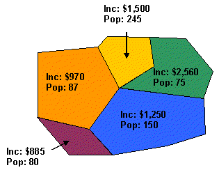
Practice: the mean income and the population
for five enumeration areas are summarized on the map below. Calculate the overall
mean income for the census tract.
c) Means using categories
If you have interval or ratio data in categories, you can calculate the overall
mean using the number of observations as the weights and the category midpoints
as approximate mean values.
|
Formula:
| 
| where:
fi = the frequency of each category (the number of observations)
mi = the midpoint value of each category
n = total number of observations
|
Example: The data below are income categories and frequency counts;
calculate the average income:
| Income category
| Frequency
|
| $15,000 to $29,999
| 25
|
| $30,000 to $44,999
| 60
|
| $45,000 to $59,999
| 38
|
Step 1 - Calculate the midpoint of each category as follows:
- Subtract the low value from the high value
- Divide this difference by 2
- Add this amount to the low value.
Example: The midpoint for the $15,000 to $29,999 category
is:
mp = low value + (high value - low value)/2
mp = $15,000 + ($29,999 - $15,000)/2
mp = $15,000 + $7,499.50
mp = $22,499.50
The midpoint for the $30,000 to $44,999 category is:
mp = $30,000 + ($44,999 - $30,000)/2
mp = $30,000 + $7,499.50
mp = $37,499.50
Step 2 - Multiply the midpoint by the frequency for each category. Add
the frequencies to get n and calculate the sum of fimi:
| Category
| Midpoint (mi)
| Frequency (fi)
| fimi
|
| $15,000 - $29,999
| $22,499.50
| 25
| 562,487.5
|
| $30,000 - $44,999
| $37,499.50
| 60
| 2,249,970
|
| $45,000 to $59,999
| $52,499.50
| 38
| 1,994,981
|
Sum 
|
| 123
| 4,807,439
|
Step 3 - Divide (fimi)
by n to obtain  .
.
= 4,807,439/123 = 39,084.87
The mean income in this sample is $39,084.87.
While measures of central tendency identify the average or most frequent value
in a distribution, they give no indication about the spread or dispersion of
the values. Are the values very similar (low dispersion) or is there a big difference
between the smallest and largest values (high dispersion)? There are several
measures of dispersion which 'measure' the degree of spread from the 'center'
of the data set.
1. Range
The range is the difference between the maximum and minimum values in a dataset.
It can be used for interval or ratio data.
Formula: Range = Xmax - Xmin
Example: your data are rainfall (mm): 102, 153, 185, 142, 112, 197,
138, 166, 88
The range is: 197 - 88
= 109 mm
The range provides a very limited insight into the amount of dispersion in
a distribution as only the largest and smallest values are considered. Also,
the range may be greatly influenced by a single extreme value in the distribution.
Example: 2nd sample of rainfall (mm): 73, 56, 61, 82, 64, 57, 165, 93,
85
The range is: 165 - 56 = 109 mm. However, 8 of the 9 values lie between 56 and
93.
2. Inter-quartile Range (IQR)
As the range is influenced by extreme values, it is often better to calculate
the dispersion for the middle of the dataset. Quartiles are the values of the
observations that divide the dataset into 4 equal parts. If you have 100 observations,
the first quartile is the value of the 25th observation; the 3rd quartile is
the value of the 75th observation. The Inter-Quartile Range is the difference
between the first quartile and third quartile of the dataset. It can be calculated
for interval and ratio data.
Formula: IQR = Q3 - Q1
How to calculate the IQR:
- order your dataset
- count the number of observations (n)
- find where Q1 and Q3 lie in the distribution using: Q1 = (n+1)/4 and
Q3 = 3(n+1)/4
- find the values of Q1 and Q3
- IQR = Q3 - Q1
Example: using the sample of rainfall (mm):
102, 153, 185, 142, 112, 197, 138, 166, 88
1. Order the data: 88, 102, 112, 138, 142, 153, 166, 185, 197
2. Count observations: n = 9
3. Find where Q1 and Q3 lie in the distribution:
Q1 = (9+1)/4 = 10/4 = 2�th observation
Q3 = 3(9+1)/4 = 30/4 = 7�th observation
4. Find values for Q1 and Q3
Q1 is half (or 0.5) of the way between 102 (2nd obs) and 112 (3rd obs)
Q1 value = 102 + (0.5 (112-102)) = 107.0
Q3 is half (or 0.5) of the way between 166 (7th obs) and 185 (8th obs)
Q3 value = 166 + (0.5 (185-166)) = 175.5
5. Calculate IQR:
IQR = Q3 - Q1
IQR = 175.5 - 107.0 = 68.5 mm
The inter-quartile range tells us where the bulk of the observations lie. Half
of the observations in any dataset lie between Q1 and Q3; a quarter (25%) of
observations are larger than Q3 and a quarter are smaller than Q1. The IQR is
less likely to be influenced by extreme values than the range. FYI: the median
is considered to be the 2nd quartile as it divides the distribution in two groups
of equal size.
3. Variance and Standard Deviation
The variance,  ,
is a measure of the average difference between all observations and the mean.
When an observation is bigger than the mean, the difference is positive. When
an observation is smaller than the mean, the difference is negative. If the
differences are simply added together, the positive and negative differences
will cancel each other out and you may believe there is no difference. To obtain
a measure of total difference, each difference is squared to remove the negative
(-) sign. To calculate the average difference, the sum of squared differences
is divided by N.
,
is a measure of the average difference between all observations and the mean.
When an observation is bigger than the mean, the difference is positive. When
an observation is smaller than the mean, the difference is negative. If the
differences are simply added together, the positive and negative differences
will cancel each other out and you may believe there is no difference. To obtain
a measure of total difference, each difference is squared to remove the negative
(-) sign. To calculate the average difference, the sum of squared differences
is divided by N.
The variance is used often in inferential statistics (as we will see in later
labs). However, in practical situations, the variance is difficult to use because
the units are squared. Therefore, we typically use the standard deviation,
 , to express the dispersion
of observations around the mean. Taking the square root returns the sum of squared
differences back to the same units as the mean (i.e. cm, mm, etc.)
, to express the dispersion
of observations around the mean. Taking the square root returns the sum of squared
differences back to the same units as the mean (i.e. cm, mm, etc.)
The standard deviation can be calculated for ratio or interval data.
|
Formula:
| 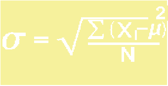
| where
Xi = each observation in the dataset
= the arithmetic mean
N = number of observations
|
How to calculate:
- calculate the mean of the data set
- subtract the mean from each observation
- square this difference for each observation
- sum all squared differences
- divide by N (this is the variance)
- take the square root (to get the standard deviation)
Example: calculate
using for the rainfall data (mm):
102, 153, 185, 142, 112, 197, 138, 166, 88
number of observations (n) = 9
1. Calculate the mean:
= 1,283/9 = 142.6 mm
2. Subtract the mean from each observation;
3. square this difference to obtain (Xi - )2
| Xi
| Subtract the mean (Xi - )
| Square the difference (Xi - )2
|
| 102
| 102 - 142.6 = -40.6
| (-40.6)2 = 1,648.36
|
| 153
| 153 - 142.6 = 10.4
| (10.4)2 = 108.16
|
| 185
| 185 - 142.6 = 42.4
| (42.4)2 = 1,797.76
|
| 142
| 142 - 142.6 = -0.6
| (-0.6)2 = 0.36
|
| 112
| 112 - 142.6 = -30.6
| (-30.6)2 = 936.36
|
| 197
| 197 - 142.6 = 54.4
| (54.4)2 = 2,959.36
|
| 138
| 138 - 142.6 = -4.6
| (-4.6)2 = 21.16
|
| 166
| 166 - 142.6 = 23.4
| (23.4)2 = 547.56
|
| 88
| 88 - 142.6= -54.6
| (-54.6)2 = 2,981.16
|
4. Calculate the sum the squared differences:
(Xi - )2
= 11,000.24
5. Divide by N:
6. Take the square root to obtain :
|
| = 34.96
| The standard deviation for the rainfall data is 34.96 mm.
|
The standard deviation is usually reported with the mean. In this case, you
would say "the mean is 142.6 mm with a standard deviation of
34.96 mm".
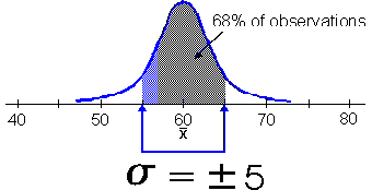
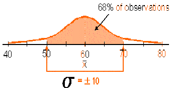
The standard deviation defines an interval around the mean. If your distribution
follows the shape of the normal curve (symmetrical, bell-shaped, unimodal),
about 68% of the observations will fall inside this interval. Therefore, the
shape of your distribution is related to the size of the standard deviation.
Example: consider two datasets where N=100, and
= 60 cm. In Case A, =
5 cm; in sample B, s =
10 cm. What shape will these distributions have?
Case A
The data in this distribution are tightly clustered around the mean, meaning
the deviation between the mean and all the observations is small. The
standard deviation is small and the distribution is leptokurtic.
| 
|
Case B
The data in this distribution are dispersed around the mean. The standard
deviation is large and the distribution is platykurtic.
| 
|
4. Coefficient of Variation
Often you may want to compare the amount of dispersion contained in different
data sets or samples. If the means are equal, the data set with the smaller
standard deviation is less dispersed. However, if the means are different, comparing
the standard deviations may be misleading. Why? A sample with a mean of 5,000
will usually have a larger standard deviation than a sample with a mean of 100.
In this case, it is better to calculate a relative measure of dispersion
in the two samples. The coefficient of variation, CV, is the ratio of the standard
deviation to the mean.
Formula: CV = /
where =
the standard deviation and
= the mean
Example: summary data for rainfall (mm) at 3 weather stations
| Stations
|
|
| CV
|
| Station P
| 123.1 mm
| 33.1 mm
| 0.25
|
| Station Q
| 56.3 mm
| 17.8 mm
| 0.32
|
| Station R
| 264.9 mm
| 43.3 mm
| 0.16
|
Although Station R has the largest standard deviation, the CV shows that it
has the smallest variation in rainfall.
The CV is dimensionless (has no units). When =
0 (no standard deviation), CV is 0. When is
large, what happens to the CV?
You have used two graphical methods to view your data: the dot plot and the
histogram. Four more ways to view your data are presented briefly below; some
are appropriate for all levels of measurement, some may apply to numeric data
only.
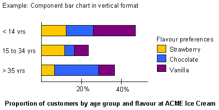
1. Bar chart
Bar charts are an excellent way of showing relative magnitudes between categories,
intervals, or locations. Histograms are bar charts, but not all bar charts are
histograms. The data may be presented vertically or horizontally, using real frequency,
relative frequency or data values. You can also break down the data inside each
major category to provide more detail (as in component bar charts). These graphs
are appropriate for all levels of measurement.
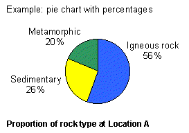
2. Pie chart
Pie charts show the breakdown of a whole into parts, using relative frequencies
or percentages represented by degrees of a circle. Pie charts are often used to
show relative magnitude, similar to bar charts. Pie charts are appropriate for
all levels of measurement, provided that interval or ratio data are collapsed
into categories. For any data type, use pie charts when you have relatively few
categories (less than 6 or 7). Pie charts become unreadable if too many categories/slices
are used.
3. Line graph
Line graphs are used to show the changes in a variable over time. A point is marked
at the intersection of time (on the horizontal x-axis) and the values of the variable
(on the vertical y-axis). The points can then be linked by a line to show the
trend over time. Line graphs are appropriate for numeric data (interval or ratio).
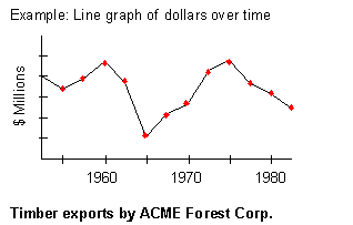
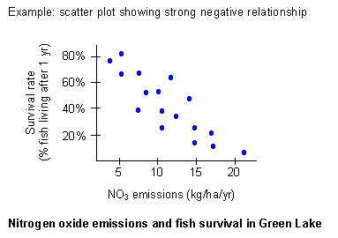
4. Scatter plot
Scatter plots are commonly used to illustrate the association, if any, between
two variables. The pattern of points indicates the type (positive or negative)
and strength (weak or strong) of the association. Scatter plots are appropriate
for numeric data (interval or ratio). Note that it would be inappropriate to join
the points on this graph by a line.
Positive: values in variables A and B both increase
Negative: variable A increases, as variable B decreases
Weak: points seem randomly scattered
Strong: points form a line (positive or negative).
Practice Answers
Data Classification:
| Variable
| Quantitative
or Qualitative
| Discrete or
Continuous
| Level of
Measurement
|
| Tree ID
| Qual
| Discrete
| Nominal
|
| Species
| Qual
| Discrete
| Nominal
|
| Height
| Quant
| Continuous
| Ratio
|
| Elevation
| Quant
| Continuous
| Interval
|
| # scars
| Quant
| Discrete
| Ratio
|
| Damage rating
| Qual
| Discrete
| Ordinal
|
Go back
Weighted mean:
Sum of Population (w) * Income (Xi) for the five enumeration areas
= 902,190
Total population (w) = 637
 = 902,190/637 = $1,416.31
Go back